This article applies to book covers in general but aligns closest to fantasy, sci-fi and horror—the genres based on made-up worlds. These books are a whole separate design group from other areas of fiction. Stock photos for books built on imaginary worlds are out there, but specific to my story, were near-to-impossible to find, meaning a cover artist was not only recommended but necessary.
When I began thinking about the cover…
I had a maddened moment when I started looking for the cover artist, but even worse was the whole process of publishing, which starts before the cover, so keep in mind this blog series begins twelve years after I began writing The Outlaw King and amidst my author’s platform strategy.
I asked myself years ago, “Why does every article on the subject of publishing a book say the same thing—the same way?” Echoes of ‘do this’ and ‘do that’ were like fingernails on a chalkboard, and by the end of all the courses, books, lectures, and writing events, not only did I retain little knowledge of how to proceed—I felt my head exploding. The first week after finishing my novel, rather than try to make sense of the next steps, I binge-watched Suits on Netflix. Then I hit every season of Friends—desperate to avoid the subject.
It took another couple of weeks before I hit the books looking for that cover artist to find that the equivalents of indie submissions from every genre were gore-fests of bad covers with stodgy, obvious homemade attempts to do what professionals master with ease. When you consider the marketing hazards of bad covers, you would think the obvious would be clear—that you should not do this alone just because you wrote the book—unless you have no other way. Then, pray and learn and do your best.
With that said, the day I finished the novel, I remember feeling surreal—a weight off my shoulders, kind of floating on a cloud feeling, but still, I felt lost. I had written the book, but was I an author? Thus, the missing elements of the still manuscript on my table were like hamburgers without buns. The words in my book were overflowing as if ready to flood my office and drown me. They needed corralling behind a book cover—a website, and all that stuff—stuff I couldn’t wrap my head around.
“The manuscript sat on my table—begging to be purchased, but it was naked—no cover, no invitations to parties—nothing.”
So, why was my first priority in all this confusion to hire an artist? Because it was the only thing that made sense to me. I’m an artist—it was fun. (This is not necessarily an advantage.) The biggest surprise came when the cover was finished, and I saw the publishing flower bloom around me—kickstarting my future.
There I was sitting at my computer—my other half and I Googled “book cover artist.” “How does an author find a cover artist?” Moreover, how does an author know a good one from the bad? What about doing it yourself?
Knowing who is good for your book cover is easier than guessing if the used car salesman is offering the right car, as artists have portfolios. But finding an artist who will work with you until the cover is exactly what you want does take some negotiations. Prepare to embrace your artist because he/she is the key to that amazing cover. I’ll get to the “Doing Your Own Cover” in another article as I help friends in other genres do their own.
If you are like me, the business end of this is interesting, yet in my time-deprived world, I was left ignorant and stressed. If you are like the other 85% of authors, the business end is frightening, and you’d rather just write. So, I’ll try to condense things.
Assignment One—Realize you are not the artist
Authors, as a general rule, are not artists. They can be the worst people to create the cover. Authors bend words to their will, while art will leave them hanging in a gibbet. You need someone who knows the industry and does more than stick men for his portfolio.
So why did I, Efrona, design my cover? First, let’s define create. I did not do the artwork, I created the original idea. Big difference. I’m an artist—a crossover/hybrid mutant author, but I still hired a cover artist to complete my idea, as I’m not an expert nor an experienced graphic designer.
This does not mean you cannot take your idea to your artists and get what you want, like I did. But if you’re wise, you will realize the power of the cover. Superman’s powers are brutally insufficient agaist a good cover. Are you better than Superman in the art department? What I’m saying is to keep an open mind to what your cover designer has to say.
Initially, I think most ponder the thought of creating their own. If you’re there, the advice is to first look at other covers:
- What do you like about other covers?
- What do you dislike?
- What makes you pick up a book?
These are great questions, but in all honesty, they are ambiguous at best. It’s like asking what you like about the gourmet meal you just ate. “What was the best thing about it? What flavor stood out? What did you dislike? Why did you order it? Okay, great you can answer, so go cook it. You might know you want salmon and that goat cheese salad with the mind-blowing dressing, but that does not enable most to replicate it.
Other lists for becoming your own cover artists are something like this:
- It must be eye-catching—mind-sizzling pauses from your target audience.
- Be different but not weirdly separate from your genre.
- Choose a strong image.
- Be careful with fonts/typography but make bold choices.
- Be bold.
- Stand out with a handwritten type and script.
- Think in terms of thumbnails.
- Be creative with composition.
- Don’t forget the spine or back cover
- Use colors as accents.
- Contrast is key.
- Convey the mood of the book through the cover design.
- Feature compelling and original imagery.
Read the list above and tell me you get it. Then imagine you have been hired to do a graphic designer’s job after reading 25 bulleted tips with short descriptions. Would you? No. Many suggest Canva, and it’s awsome. I’ve helped friends put covers together with Canva—but not like my cover.
Assignment Two—Head to the bookstore
The first step is taking a look at book covers as you would creating your own. You’ll get bored really quickly. It’s as if they are all related in a pool of incestuous orgies birthing clones. But it still starts here. And it doesn’t matter if you think you know what you want on the cover or if you’re not sure. The bookstore march is simple. Find your genre and stargaze. Stand there and look at cover after cover.
“Yes, I like this one.”
“No, it’s not right.”
“Ugly!”
“What the heck?”
All those thoughts will cross your mind until you see a book and say, “Hmm, that one I like.” Then repeat the process until you have 3-5 covers you would marry. These covers are the ones you will send to your cover artists—giving him/her a peek into your style.
You’re in the first stage. You have found three to five covers you lust after.
Now what? Trust me. You won’t figure things out it will just happen. You’ll think you know, but as the artist begins to send you drafts, that’s when you realize all those things you read about eye-catching, bold typography, color accent, blah blah blah, only now make sense when a pro puts it together—and you begin to see and feel it.
Americans think they know what a croissant is. But any American who has spent time in Paris knows the truth. A great croissant is no more than a half-hour old. It’s not all curled up in its perfect crescent shape, and it’s certainly not bread-like. Its crispy exterior crumbles as you bite it, revealing those thin laminated layers of golden goodness—fulfilling its perfection. The same thing applies to the author who creates their own cover and says, “Wow, this is good,” but then realizes later it’s not that good once they’ve seen the real thing.
Assignment Three—Create a cover brief
Facts: When an author is self-publishing, one of the first things publishers suggest is to assemble a cover brief. It defines the genre or category—target audience, describes themes that might affect the cover’s aesthetic, and compares other covers that would sit next to it on the same shelf. It defines your project criteria to choose the right cover artist who has experience and design sensibility in your genre.
A brief should include:
- Authors name
- Tagline
- Description of the book/blurb
- Target audience
- Survey of your comparable authors and genre
Prepare thr brief—emphasizing the specifics of your book. This kind of consultation and vision given to the artists will make or break your first draft, which usually brings on the sinking desire to cry out, “What is this?” So, prepare your descriptions as much as possible. And don’t forget to include your favorite book covers.
There are artists who offer to read your book before starting the design. That’s cool, and it surely could help, but I would never choose one for that reason.
Assignment Four—Research the artist.
If you have unlimited funds, find out who did the cover of that best seller you worship on your bookshelf—you know the one that kept you writing and most likely leads the sales in the genre of your own book. Then go from there. But if you’re like the rest of us, head over to Fiverr, Reedsy, the internet, and all its offerings, and start there. Again, you will learn quickly. It’s shit out there. Finding the right person is not that easy! Reedsy’s “Request quote” will have you drinking margaritas at 9 in the morning, and Fiverr is not too bad, but with all the sloppy bios and poor portfolio pictures, you’re even more confused by the end of the day.
Price variances can be drastic differences between top-rated and the new-artists on the block—but new-artists—rush in like waves of enthusiasm. Yet, Top Rated theoretically is less risky.
I found the secret is narrowing your needs. Make a list of what matters and stick to it. Don’t compromise. That’s where it starts. When I say ‘what matters,’ I’m not talking about the lists we read above. I’m talking about that idea specific to your book.
Therefore, judge the portfolio illustrations for the art that supports that image that pops out from the story, not art that you happen to like. So, if you see this amazing cover of cartoon chickens being spewed from clouds, and it’s cool as hell, pass it up if your cover is not best suited for cartoon chickens. Make sure at least one of the portfolio pictures is a style that fits the cover brief. This narrows things quickly.
I ended up with Reedsy because the portfolios spoke loudly, and I discovered Reedsy had artists that do some of our favorite best sellers as well, and that impressed me—only because those covers were stellar. It’s one of my favorite platforms for my author needs.
I paid less than $2000 for my cover. My goal was a hard and eBook cover. Alejandro Colucci had the style I fell in love with. On Reedsy, though, I saw several artists I found appealing. And I did find Reedsy to be professional, with an easy process to view the portfolios and decide. In contrast, some sites were so unfriendly that I gave up for that reason alone.
What were my other options based on price? For what I was asking for, an original creation, I found many offers for $400-600, but the quality paled in comparison with promises from artists who had nothing in their portfolio that came close to my cover brief.
My first commission to a sketch artist.


I hired the sketch artist long before I did the cover. I asked for a winged hilt, and the black and white sketch to the left is what he produced for $140.00, which was nearly a waste of money for me.
I asked for a white background, no characters, clean and sharp— a minimalistic design that was not busy or crowded. What I got was a nice sketch. Everyone loved it, but it did not fit the book brief nor my style. It was just cool.
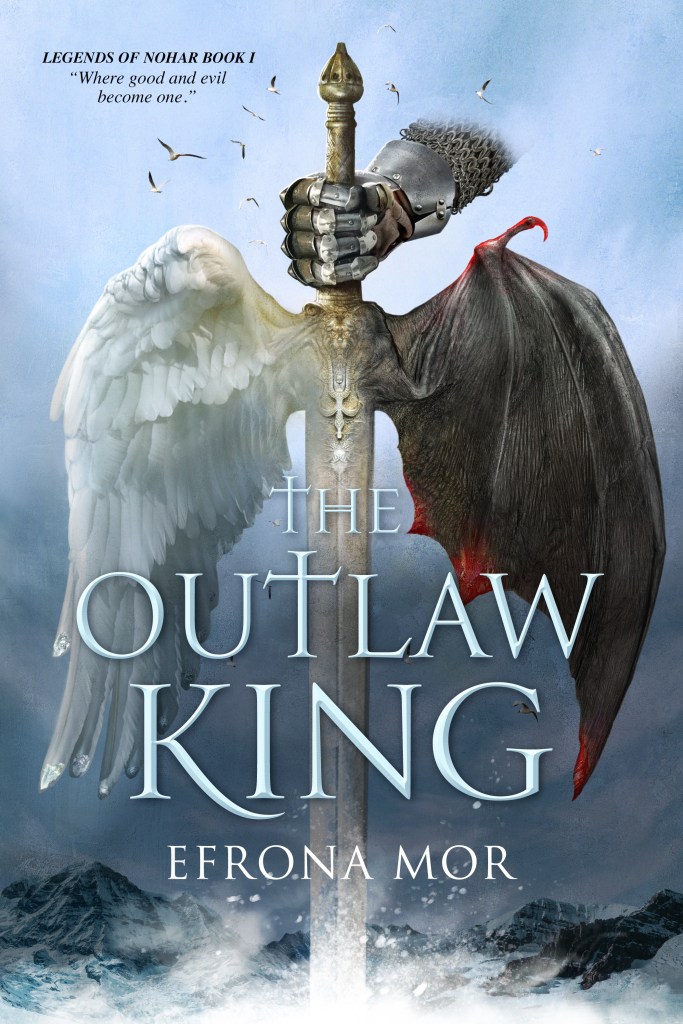
The genre needs to be clear at a GLANCE.
For fantasy and sci-fi covers, I think it’s more complicated as far as the design goes. A romance novel has tons of ideas and professional pictures available for a much cheaper price. I’m not saying it’s easy, but try thinking up this winged sword with feathers on one side and bat wing on the other. No stock photos, honey!
My Poor Cover Brief
This is the description I wrote, and it was not enough. I was time-deprived and did not know what a cover brief was. Therefore, I left Alejandro to read my mind. Think through your brief, as it can make or break the design. You can skip my cover brief, but if you’re interested in seeing what my aritis worked with, this is it.


The artwork I had done for my map I liked, but the sword with wings and two characters was not to my liking. The added characters are an overload. Her staff is nonexistent in the story. My female protagonist is not skinny and does not wear a helmet. Demons are not depicted like this, and the theme was not medieval. The only part of this sketch that works is the idea of the wing.
- It is too dark. (I want a white or light background)
- It is too busy.
- I did not want characters in the picture.
Era: Medieval—Kings—Queens
Location: an island surrounded by seas
Story: a journey-driven story of friendship and power that does not mirror Merlin, but rather an unseen power of excelled physical and mental strength, along with advanced knowledge that remains hidden above the clouds as shown in the map attached.
- A clean design– not busy.
- The focus is the winged hilt, strong wings like those of an eagle. (I like art that implies movement.)
- White or light background
- Jewels on the tips of the feather wings are raw shapes. They are not cut diamonds, but I’m open to suggestions.
- Red talons on the tip of the bat wings are like crystals.
I want the wings to show the difference between soft light wings with tiny jewels on the tips and the black bat wing with red talons.
Here is a description from my book for the jewels on the end of the feathered wings:
“Lights on the tips of her wings flickered with the power of her emotions. Rare tiny jewels grew on the tips of each feather’s shaft as a Pothian’s powers advanced.”
The sword should be unique and Gothic, not Asian influence. Can the wings be the hilt? The hilt in the picture I had done looks small. The hand on the hilt is nice, but it might be too much.
Please:
- No woman holding a staff,
- No demon, No black background.
- With a light background (I’m open but this is what I envision.)
- I’ve added a few book covers and art pieces that caught my eye.
I chose Alejandro Colucci, and this is what happened
He offered me several ideas after reading the above notes for the wings, both stylish and beautiful stone depictions.
I’m crazy about this style of art, so I initially folded and thought, “Okay, that’s amazing,” but it was a mistake. As I said earlier, do not choose cover designs because they are awesome.
Choose them to match your book.


First Draft
Thus, when I saw the first draft of my cover. I froze. It was not what I wanted. It was good. Everyone raved, and I almost thought I should keep it, but I envisioned something else—this amazing design conflicted with my ideas and affected the cover’s aesthetic—drifting away from my world-building themes.
When I realized I had allowed Alejandro to proceed after he sent me the stone examples, I felt bad. Luckily, I did make it clear I was not sold on the stone images, but I wasted his time, and that’s not fair.
What bothered me?
- A young, clean, soft hand holding the sword was modern.
- The stone wings versus real ones
- The font and its placement
- No talons on the bat’s wings
- No jewels on the feathered wings
A good cover brief would have set the era and made it easier.
It was obvious to me what my cover was going to be from the beginning. Just kidding.
I did not know until the very end what the cover would be. Twelve years later, it hit me. I had imagined characters on the front—the name of the worlds—perhaps some twisty attractive tag with Mistra, one of my protagonists, and her white wings, stunning figure, and strong character, or the outlaw king himself. Don’t kings take center stage? It wasn’t until I nearly finished the book that it hit me that the sigil of the winged sword was the basis of the story.
Alejandro was not only a pro; he was willing to put forth what was needed to bring the cover to my dream description.
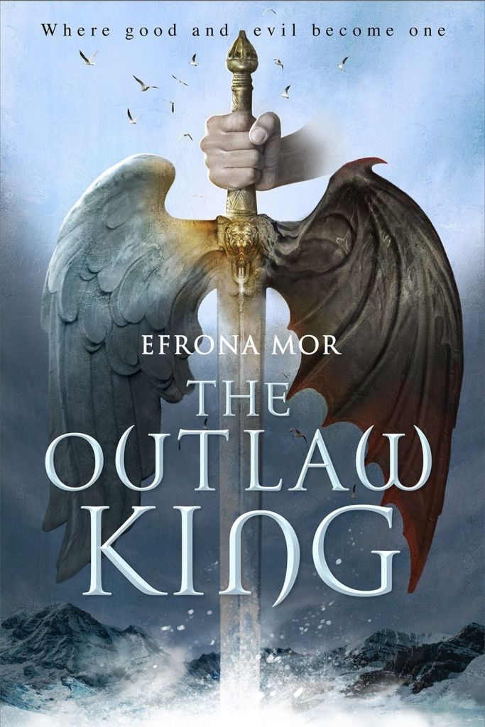
Second Draft


The next design came, and I smiled, but I still wanted more. I was not crazy about the silver gauntlet. It did not match the composition colors; hence a cover brief could have specified that it was not a Monty Python movie. Someone who had not read the book would not understand how the clean, shiny gauntlet just wasn’t it.
The lowercase tag at the top—bugged me as well.
“Efrona Mor” above the title seemed to cover the amazing work he’d done.
Third Draft

I must say Alejandro never said it, but I had to have driven him crazy with my replies. We went back and forth over fonts, placement, color, and small details. His choices were stellar. His skill was obvious, and each font style had an amazing presence on the cover, but he kept going until he found the one I felt was right. Thank you, Alejandro!
Viola—My Dream Cover Finished
Alejandro worked his magic and finished it with the final draft. When I saw it, my heart quickened, and I was happy.